
This feature has been inspired by numerous user requests.
We are not entirely sure what name to give this new feature so we have called it “Use Alternative Axes”
First some context. There is a need in some school systems for a graph that is a Histogram but that doesn’t just have a scale on the x axis. This is particularly the case when the graphed data is integer amounts.
For example, for this data table…
| x | 0 | 1 | 2 | 3 | 4 | 5 | 6 | 7 | 8 | 9 | 10 |
| f | 3 | 2 | 5 | 6 | 8 | 9 | 6 | 7 | 4 | 2 | 1 |
Some users wanted to produce this
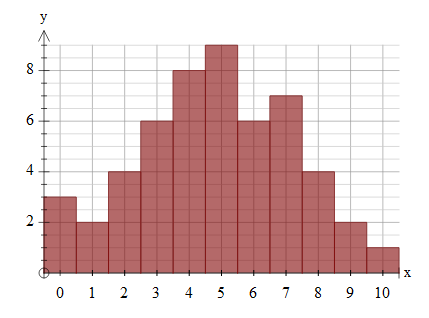
but FX Draw and FX Stat would only produce this

We have now added the ability to use the alternative axes style.

If you are graphing grouped data such as this data that is grouped into 0-5, 5-10 and so on, the alternative axes will mark the centre of the division – another commonly requested feature.

Discover more from Efofex News
Subscribe to get the latest posts sent to your email.
