
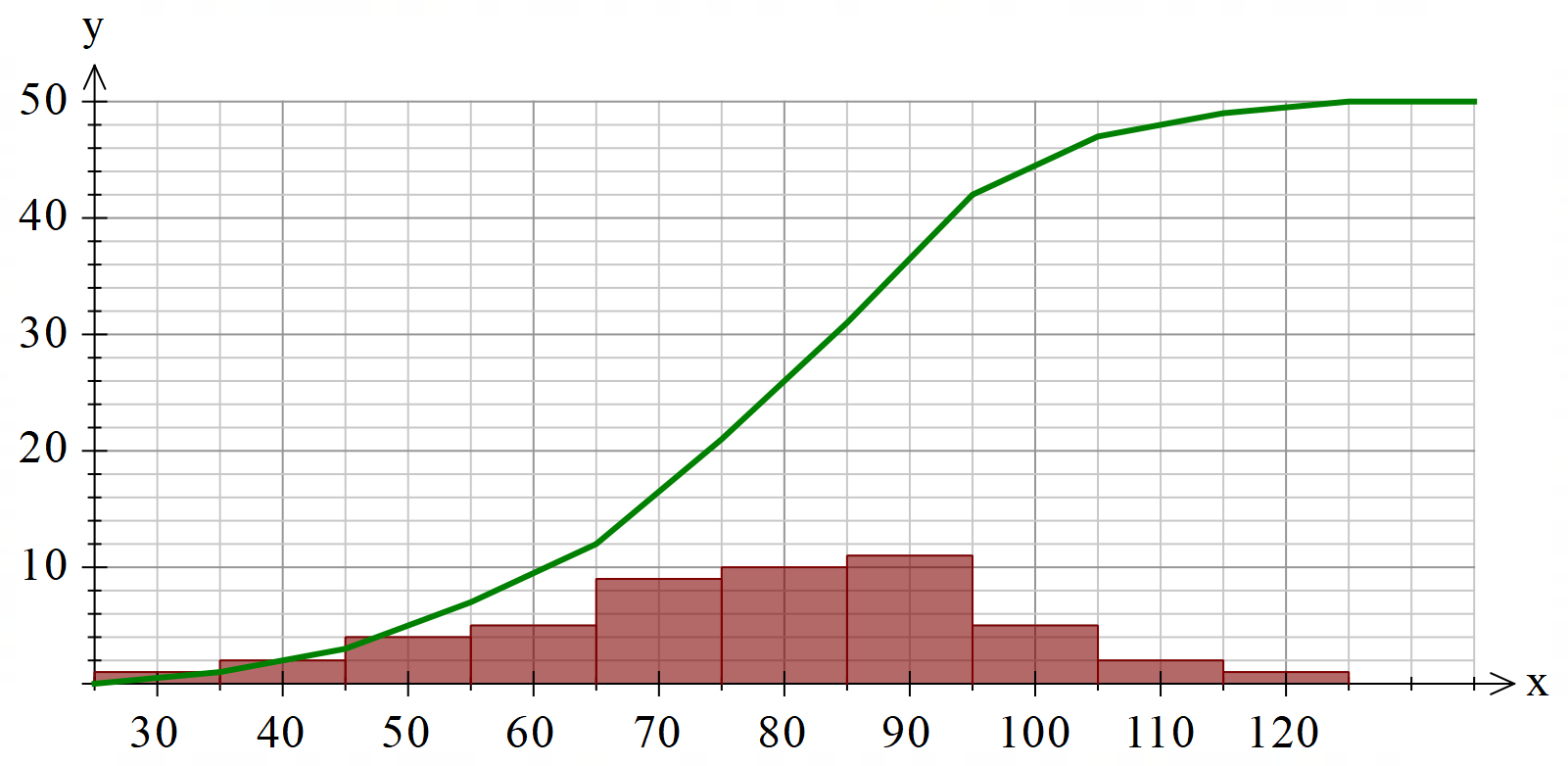
Grouped data graphs (histograms, frequency polygons and cumulative frequency graphs) now have the option of placing the class centres in the axes. This is particularly useful for NSW teachers who seem to prefer this option.

You can turn on class centre scales in the options for the affected graph types.
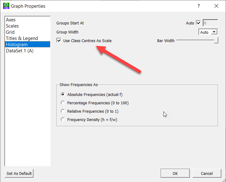
Long term users of our products will know that we previously had a version of this mode of graphing (it was called Use Alternative Axes). The new system is massively improved and allows you to combine cumulative frequency curves with other graphs.
Discover more from Efofex News
Subscribe to get the latest posts sent to your email.

Looks great guys thanks can’t wait to use it